
Experiment 01, letters with physics
Spring, push, settleMove closer. The letters make room for you.
Each letter is a small spring. Your pointer pushes, the spring pulls back, and the line settles by itself.
Typographic Universe
Yazan Nasser, Developer & Digital Designer
A magazine about letters, made of letters. Read it from the first page to the last, or open the index and jump.
Yazan Nasser
Developer & Digital Designer
A specimen of eleven letters
Yazan Nasser
Plan view, scale one em to one storey
Condensed letters stand as towers. Extended letters become halls.
Eleven letterforms of one name, placed along an avenue and seen in true perspective. Width and weight decide the building: the width axis sets the footprint, the weight axis the mass.
Tower Y, width 62
Two disciplines, one practice
Developer and digital designer.
Role 01
Development: structure, logic, interaction, performance.
Role 02
Digital design: type, layout, color, motion.
The designer decides how something should feel. The developer makes sure it actually does. In this practice they are the same person, working on the same file.
End of World 01
Every letter is a window. Keep scrolling and step through the zero.
Next: World 02, The Typographic Dimension
Anatomy of a letter
One capital A, drawn for this page and examined at the scale of a building. Five parts, five names.
Part 01 of 05
Apex
The point where the two strokes meet at the top of the letter.
Part 02 of 05
Counter
The space enclosed by the letter. Type is drawn by its spaces as much as by its strokes.
Part 03 of 05
Crossbar
The horizontal stroke that holds the two legs together.
Part 04 of 05
Leg
A stroke that comes down to rest on the baseline.
Part 05 of 05
Baseline
The invisible line every letter stands on. Everything else is measured from it.
Back to the whole
Five parts, one decision: a letter.
Nested frames of type, each holding a smaller copy of the page: infinite typography, type inside type inside type.
Every frame holds the next one.
Fifteen nested frames, each 74 percent of the last. Scroll, and the page keeps opening without ever reaching the end.
Depth is made of decisions about what sits in front.
Five flat planes: a field of color, a photograph, a word, a strip and a disc. Overlap them and the eye starts reading in depth. Scroll and each plane moves at its own distance from you.
SignalRead in frontPlane four of five
Scan line, width 62 to 125, weight 200 to 900
Every letter is a decision Weight is a voice Width is a pace Space is a breath.
A variable font carries a range, not a single style. Here the same five lines are set twice: once thin and condensed, once heavy and extended, and the reading line decides which one you see.
Stage 01 of 04Stage 02 of 04Stage 03 of 04Stage 04 of 04
Marks become signs, signs become words, words become a story.
Marks. Before language, a gesture left on a surface.
Signs. A mark that has started to stand for something.
Words. Signs that a group of people agree on.
Story. Words placed in an order that matters.
Four stages, five tiles, one composition. Each word arrives in its own typeface, width and weight, and the page changes color around it.
The introduction
I design how things look, and I build how they work.
I'm Yazan Nasser, a developer and digital designer. This portfolio is set as a magazine: seven worlds, thirty-five chapters and four projects, held together by one idea, that typography can carry an entire experience.
Four principles
A beautiful typographic composition is better than bad 3D.
Typography first.
Type is the primary visual language here, not decoration laid on top of a layout.
Every movement has a reason.
A deliberate start, a deliberate end, and stillness in between the moments that matter.
Quality over quantity.
The aim is never the most animations on a page. It is the right ones, timed well.
Nothing fake.
Every interaction works, or it does not appear. No dead buttons, no placeholder magic.
A picture essay in five figures
A visual vocabulary for this edition.
Print, space, light, texture and color: the five materials the pages of this magazine are built from. Each figure stands for one of them and lends its palette to the chapters around it.
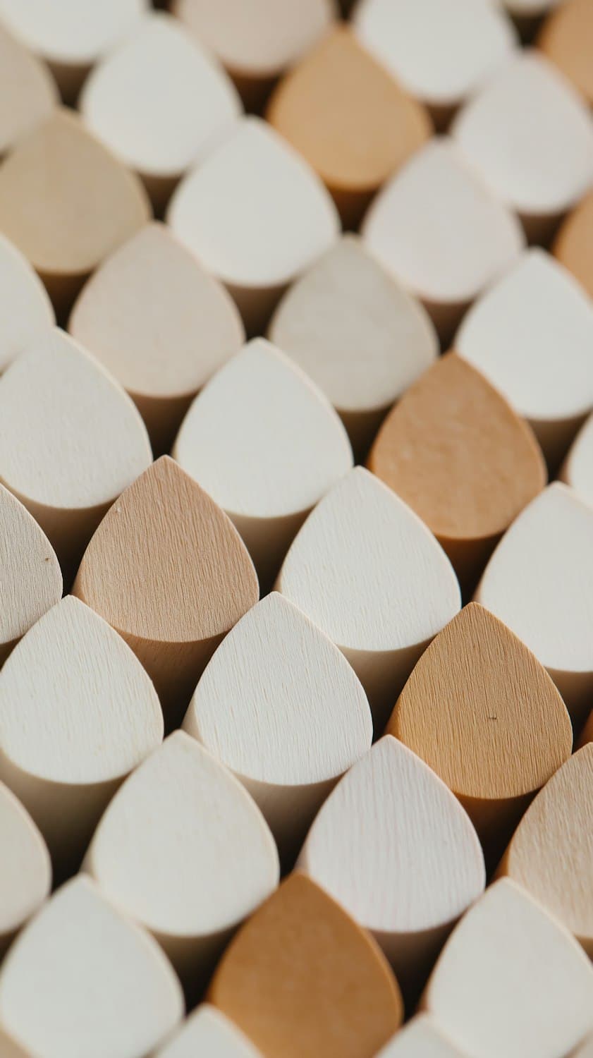
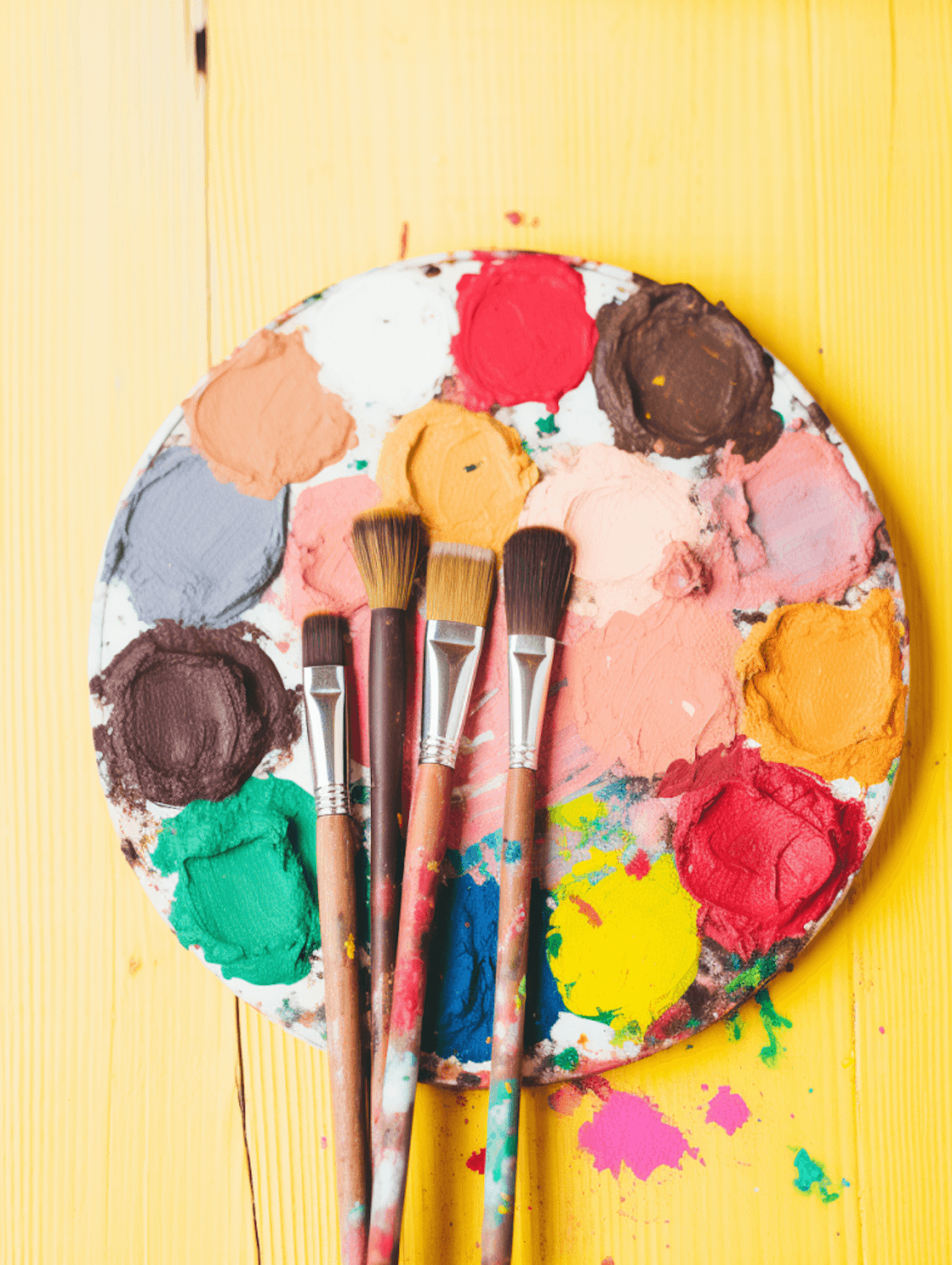
Nothing on these pages is decoration for its own sake. A photograph earns its place by lending the type a color, a texture or a rhythm.
Idea
An idea is a point: small, bright, and easy to lose.
Concept
A concept gives the point a shape and a direction.
Design
Design decides every detail of that shape: grid, type, color, hierarchy.
Product
A product is a design that works, in a browser, for a real person.
Five refusals, one promise
Nouglymeshes.
Nouglymovement.
Nogenericscrolling.
Norepetitivetemplates.
Nofakefunctionality.
Every pixel, deliberate.
Signed, Y.N.
Four rooms.Four projects.
Each project gets its own room, its own color and its own way of setting its name. Point at a room to hang it on the gallery wall.
Room 01, case study
My Subs
Room 02, case study
Ostudent
Room 03, case study
FutureGen
Room 04, case study
3Truth
Page reserved
The next edition.
This page is held for the next project. It has no name yet, so it has no headline yet. When it is ready, it gets its own room in this exhibition.
Two letters, extruded.
The initials of the name, drawn as outlines, pushed into depth and lit like an object on a table.
Material
Electric blue under a clear coat, with a thin-film shimmer that shifts with the angle.
Drag to turn the letters
Move the pointer through the field
Noise folded into itself three times, computed for every pixel on the graphics card. Nothing here is a video: the field is drawn live, about sixty times a second, and only while you can see it.
Same seed, same artwork
Glyph Y · Seed 1907 · 0%
A letter, set loose.
The composition is computed, not drawn. Change the seed and you get a different piece; keep it and you get the same one, line for line.
Save PNG downloads the canvas exactly as you see it, at the resolution of your screen.
Four surfaces, one light
The same word, made of four different things.
Chrome, glass, foil and paper are not images here. Each is a stack of gradients and shadows that recalculates as the light moves. Move across the tiles, or drag a finger over them.
Experiments 01 and 02
Move closer. The letters make room for you.
Each letter is a small spring. Your pointer pushes, the spring pulls back, and the line settles by itself.
Every letter is a decision
Archivo variable: width 62 to 125, weight 100 to 900. Same font file, every setting.
Every experiment of this issue, with its working notes, is collected in the laboratory.
Enter the laboratoryThe Expertise Journal
Section A, Development
Development is where a design meets the real world, and either holds up or does not.
This edition is a working product, not a picture of one. Every page is a real address that can be opened directly, shared and reloaded, and every link that leaves a page goes through the same transition engine.
That engine covers the outgoing page, waits for the next one to load, swaps them out of sight, restores your scroll position when you come back with the browser buttons, and then reveals the new page. Five transition styles share that one mechanism.
The profile, the exhibition and the letters you send are stored in a database and edited without touching code. The heaviest pieces, the 3D sculpture and the shader, load only when you come near them and stop working when you scroll away.
page-shell.tsx
1cover.then(() => {2 if (cancelled) return3 transitionStore.setRevealPending(Boolean(state.active))4 setDisplayed(incomingRef.current)5})Section B, Digital Design
A design system, decided before a single page was set.
UI and UX here start from a small set of rules: eight colors with jobs, one variable typeface with a serif for contrast, a twelve column grid, and a few promises about how the interface behaves.
Twelve columns. Text often takes five, images seven, and the best pages break the rule on purpose.
Section C, Creative Coding
Twenty lines of code, one rose made of a name.
Creative coding treats a program as a drawing instrument. This function walks around a rose curve and drops a letter of the name at every step. Change one number and the drawing changes.
1const drawLetterRose = (context, size, petals, text, colors, family) => {2 const center = size / 23 const radius = size * 0.444 const steps = 7205 const letters = text.replace(/\s/g, '')67 context.textAlign = 'center'8 context.textBaseline = 'middle'910 for (let step = 0; step < steps; step++) {11 const angle = (step / steps) * Math.PI * 212 const distance = Math.cos(petals * angle) * radius13 const x = center + Math.cos(angle) * distance14 const y = center + Math.sin(angle) * distance1516 context.fillStyle = colors[step % colors.length]17 context.font = `800 ${8 + (Math.abs(distance) / radius) * 18}px ${family}`18 context.fillText(letters[step % letters.length], x, y)19 }20}Section D, Technology
The index.
The technologies listed here are the ones this edition is actually built with, each with the chapters where it does its work. Follow a chapter number to see it running.
Section E, The Creative Process
From an idea to a working product, in eight frames.
Frame 01
Brief
Write down what it must do, and what it must never do.
Frame 02
Reference
Collect color, texture and light before choosing anything.
Frame 03
Type
Choose the typefaces first. They decide the voice.
Frame 04
Layout
Set the grid and the hierarchy, then break them on purpose.
Frame 05
Motion
Give every movement a start, an end and a reason.
Frame 06
Build
Make it real: routes, data, performance and accessibility.
Frame 07
Ship
Publish it, read it on a phone, and fix what feels wrong.
Frame 08
Again
Start over with the next brief, a little better each time.
Write down what it must do, and what it must never do.
Collect color, texture and light before choosing anything.
Choose the typefaces first. They decide the voice.
Set the grid and the hierarchy, then break them on purpose.
Give every movement a start, an end and a reason.
Make it real: routes, data, performance and accessibility.
Publish it, read it on a phone, and fix what feels wrong.
Start over with the next brief, a little better each time.
Four disciplines, multiplied rather than added. Take any one away and the product is zero.
Six close-ups
Details, enlarged until they become pictures.
Every tile is rendered live from the same type and shapes as its chapter. Select one to go back to where it came from.
End of Issue Nº 01
Fin.
Every chapter, every transition, every letter:deliberately designed.
Thirty-five chapters, seven worlds. Thank you for reading to the last page.
The letters page
Letters to the editor.
A project, a collaboration, or a word about this issue: write it here. Every letter is kept and read.
Developer & Digital Designer
Typographic Universe, Issue Nº 01
